MOodring
role
End-to-end UI/UX designer
User research & synthesis
Wireframing
Prototyping
Results
Developed a zero-to-one product across all stages of the design process
Applied data-driven insights and iterative user testing results to continually refine interaction design and enhance overall usability
Timeline
9 months
Jun 2025 – Feb 2026
Amidst a worsening global crisis of mental health, alongside a crisis in available psychological support services, a new crop of ‘digital wellness’ tools promises to be your therapist and your best friend, in your pocket.
As these tools become an inevitability (reaching for ChatGPT is a far more accessible and immediate solution than navigating the mental healthcare system, for example), there is now more than ever a pressing need for thoughtful digital tools that facilitate meaningful self-reflection. Moodring is a case study about how we might leverage artificial intelligence to enhance mental health in ways that help people think more – more deeply, more constructively, more intentionally – not less.
The antidote: Moodring
Moodring is a conceptual AI-assisted journaling app that encourages deeper, more informed self-reflection by acting as an interpretive intermediary, or a mirror, between users and their writing.
Unpacking the problem
A 2025 US survey found nearly half (49%) of respondents had used a large language model (LLM) for psychological support within the past year. Similarly, a 2024 Australian survey found that 40% of mental health professionals incorporated AI into their practice – primarily to obtain "quick mental health advice". Together, these figures highlight a growing reliance on digital tools for mental wellbeing and a critical need for high-quality, intentionally designed solutions.


The problem with current AI-based mental health care
(why supercomputers can’t be therapists)
AI chatbots are designed to be agreeable.
The value of therapeutic approaches such as cognitive behavioural therapy (CBT) lies in having one’s own assumptions (or cognitive distortions) challenged, enabling their reframing. A digital tool that affirms its user’s thoughts and feelings by design is fundamentally ill-equipped to play the role of therapist in our post-digital age.
AI tools are contraindicated for thought.
AI tools are built for productivity, and thus operate on the implicit assumption that offloading or reducing work (or cognitive load) for the user is a net benefit. Outsourcing thinking as such has many practical applications, though the deep, considered self-reflection core to therapy is not one.
I began Moodring’s formative market research with a competitive analysis of existing journalling and mental wellbeing products. I mapped these tools across two axes: degree of personalisation and depth of reflection supported, approximating value and experience respectively.


Products clustered away from the upper-right quadrant, indicating that even AI-driven journals remain shallow and generic when measured against the theoretical benchmark of therapeutic intervention. This gap defined Moodring’s positioning: an AI-assisted journal designed to deliver genuinely personalised insights and support sustained, deep self-reflection.
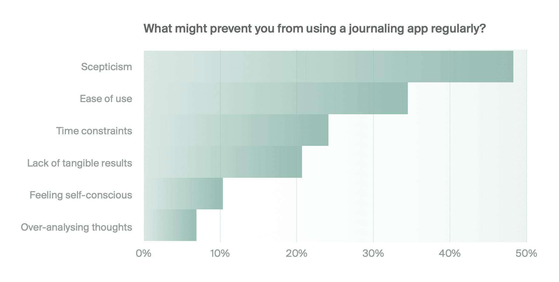
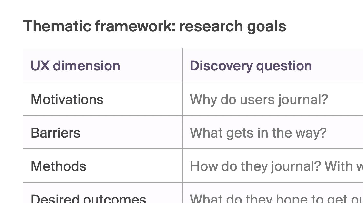
Understanding my users
To better understand Moodring’s prospective users, I carried out a series of formative user research consisting of a survey, one-on-one interviews and a thematic analysis of the r/Journaling subreddit.
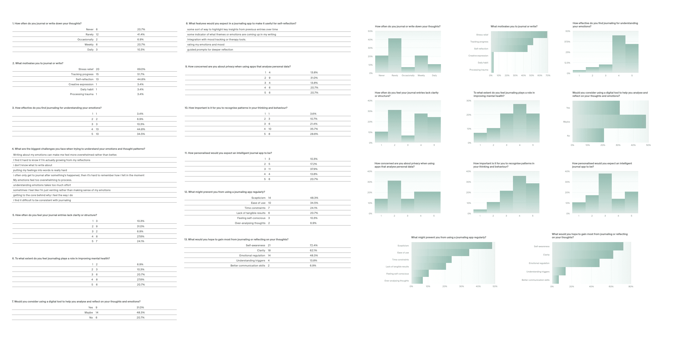
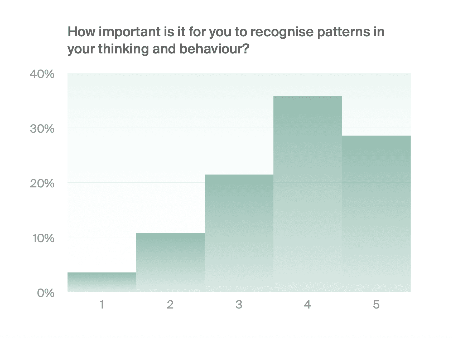
Survey
29 respondents
13 questions
+
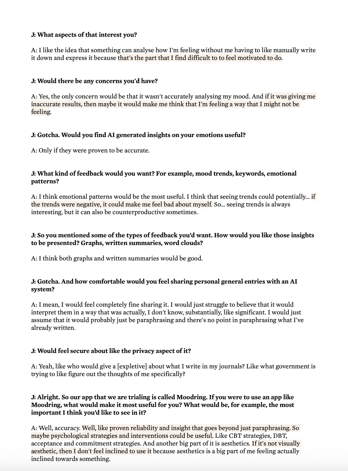
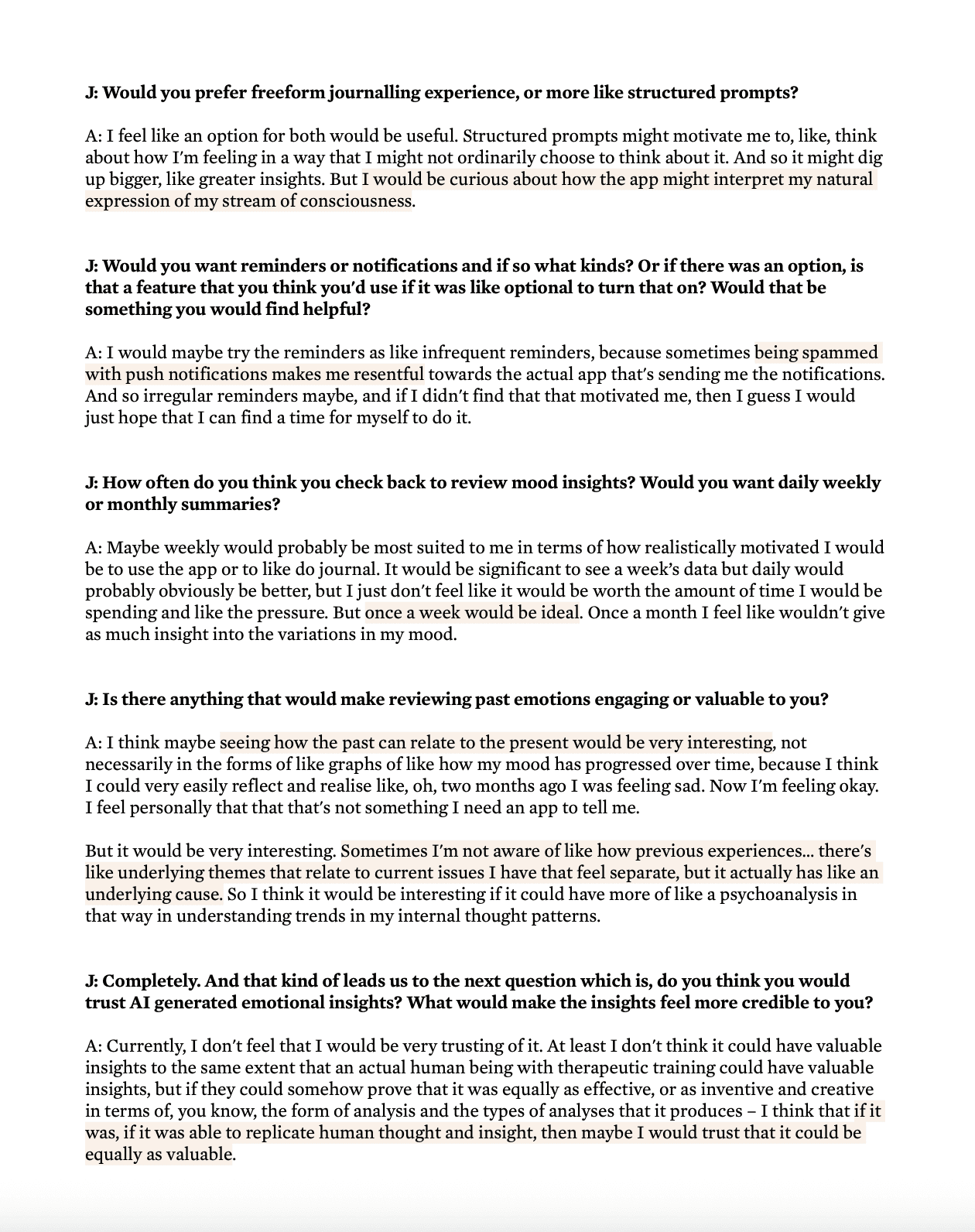
1-on-1 Interviews
4 participants
114 minutes of audio
+
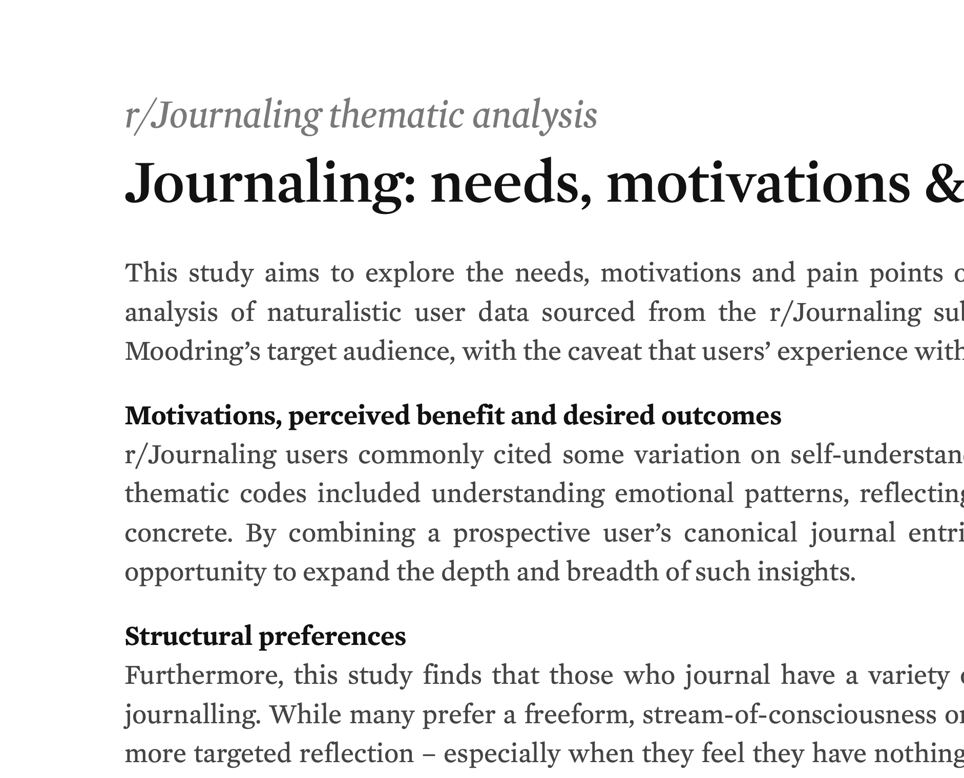
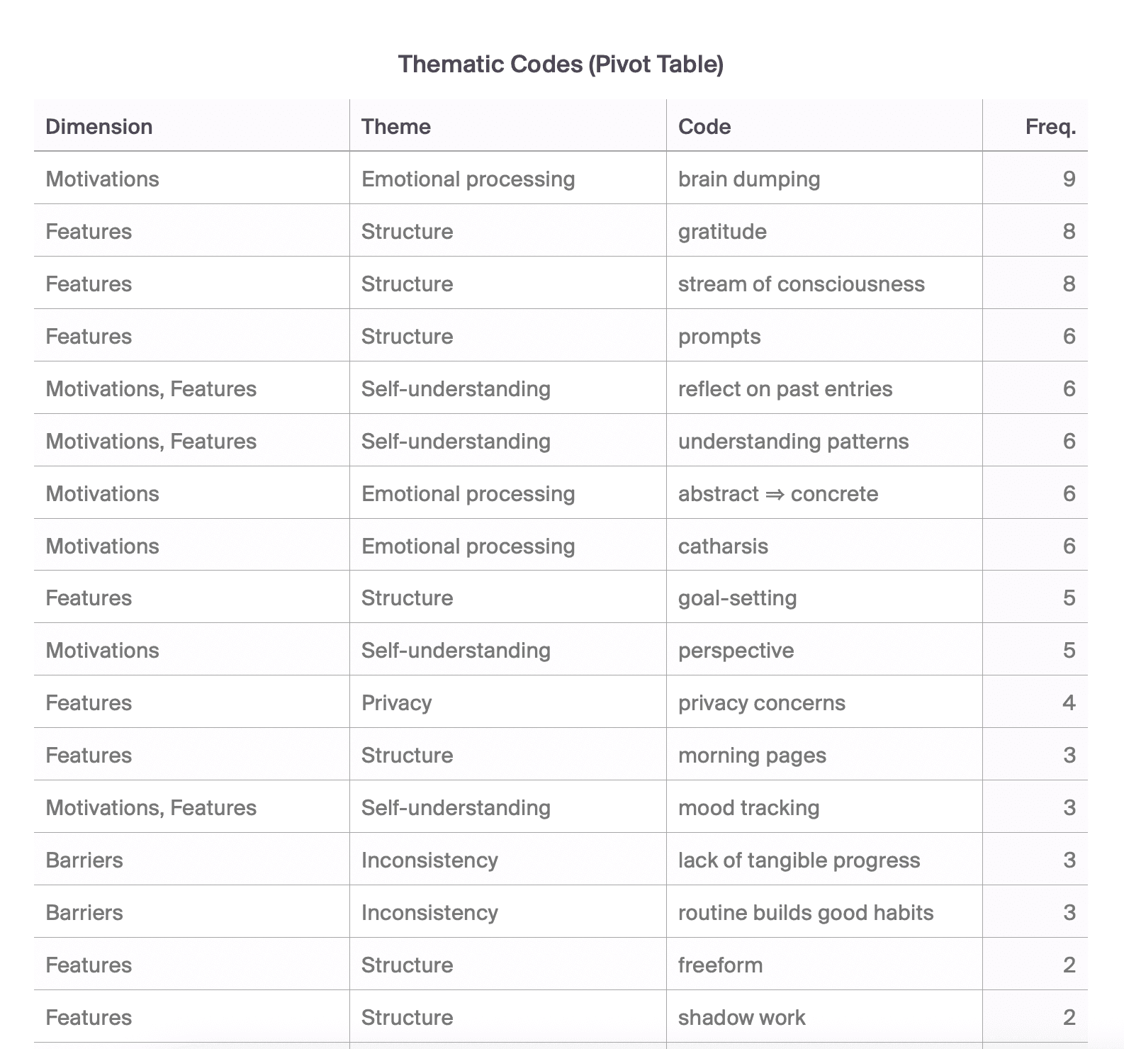
Thematic Analysis
34 threads
123 unique comments
8 overarching themes


Ideating solutions
With the problem clearly defined, I switched back to divergent thinking and began the develop phase of the design process. I formulated a foundational how might we question to guide my design direction: “How might we reframe negative emotions as opportunities?”.
The opportunities in this space
(how supercomputers can help us think better)
I used a prioritisation matrix to evaluate and compare features, informing the scope of my minimum viable product (MVP). I prioritised quick wins from the upper-right quadrant, as well as some more difficult but high-value features that were essential to solving the core problem.
HIGH-VALUE
LOW-VALUE
EASY
DIFFICULT
Opt-in skeuomorphism
Lock recent
entries
Streaks
Smart notifications
Horoscopes
Gamified reflection
Health data integration
Network map
Weekly digest
Auto-annotated
highlights
Insights feed
Time travel
Lens selector
User-defined journal structure
Context-aware prompts
Prioritisation matrix
From my MVP, I developed low- to mid-fidelity wireframes, which I also used to visualise a range of user flows and the relationships between them:
Mid-fidelity wireframes and flows
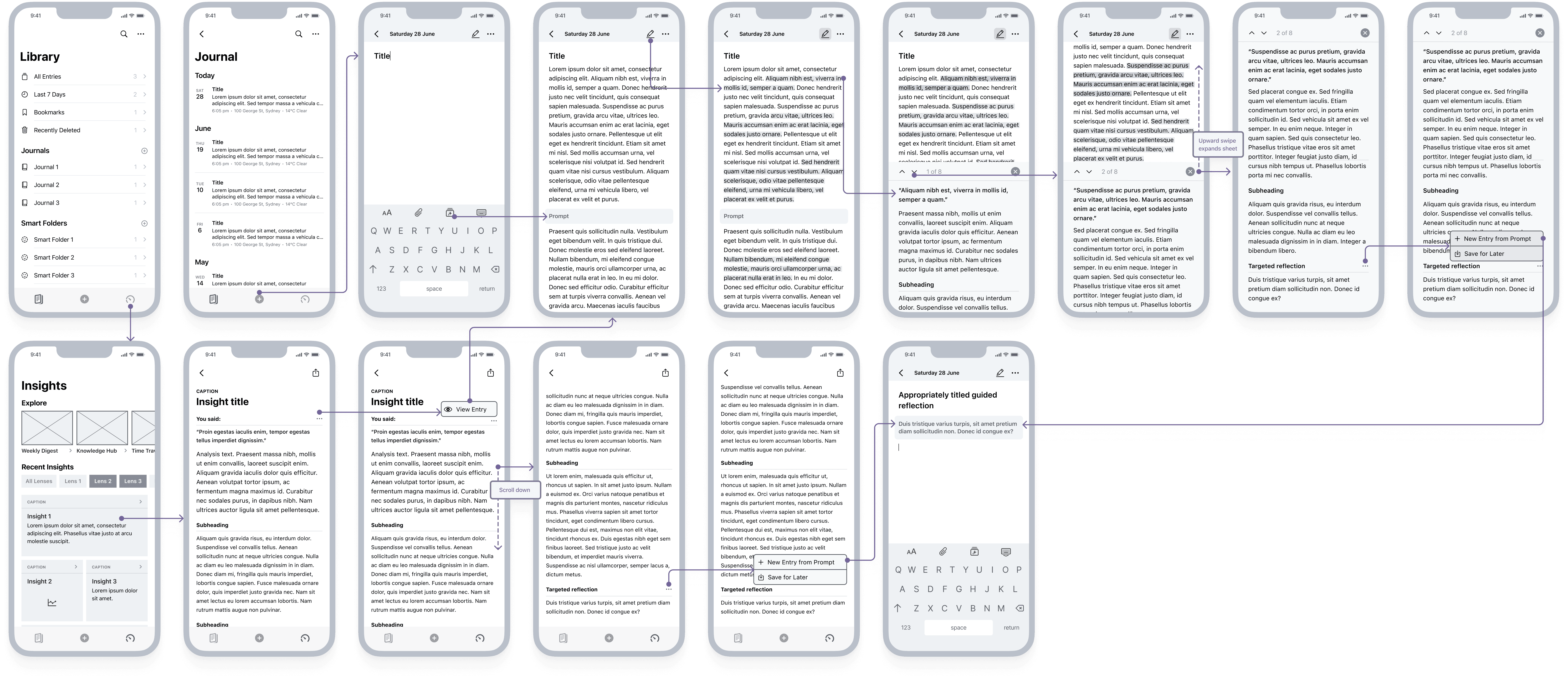
Designing the product
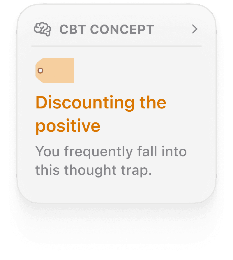
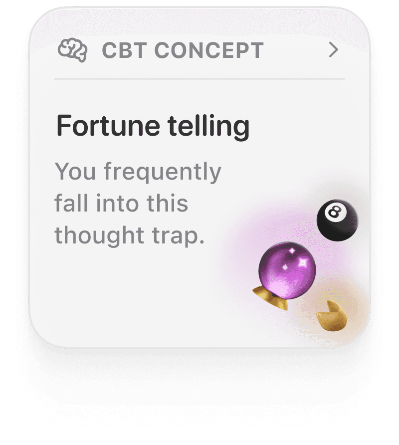
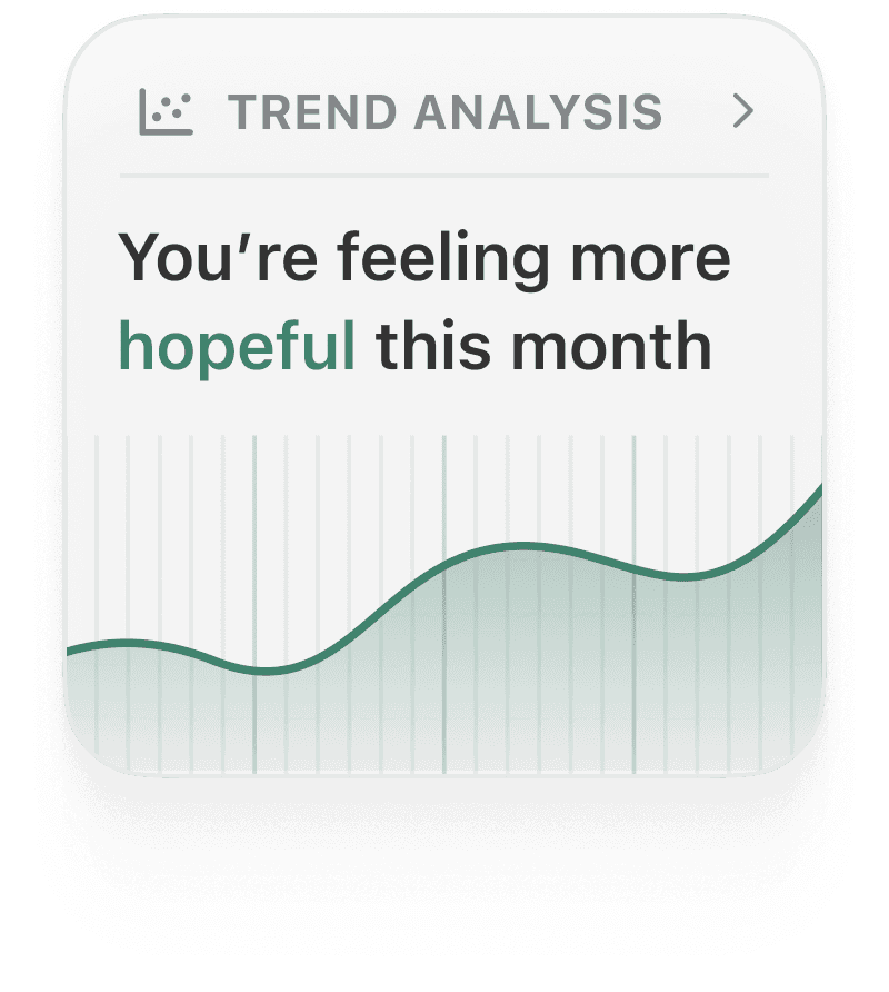
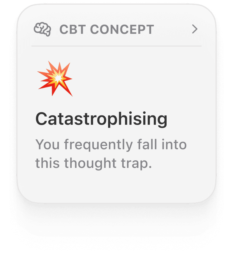
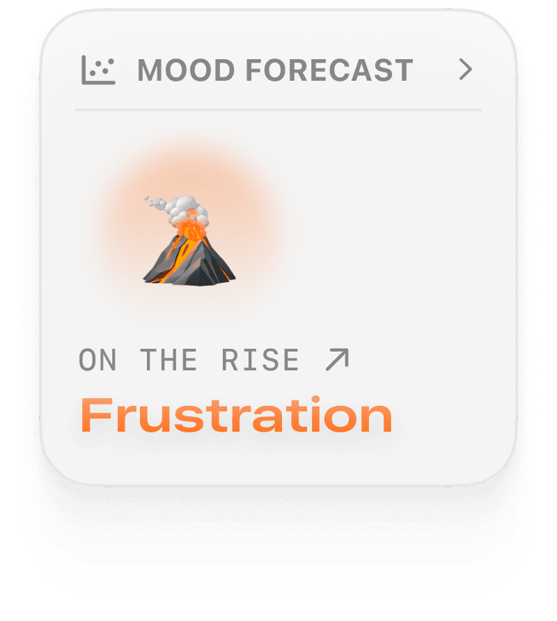
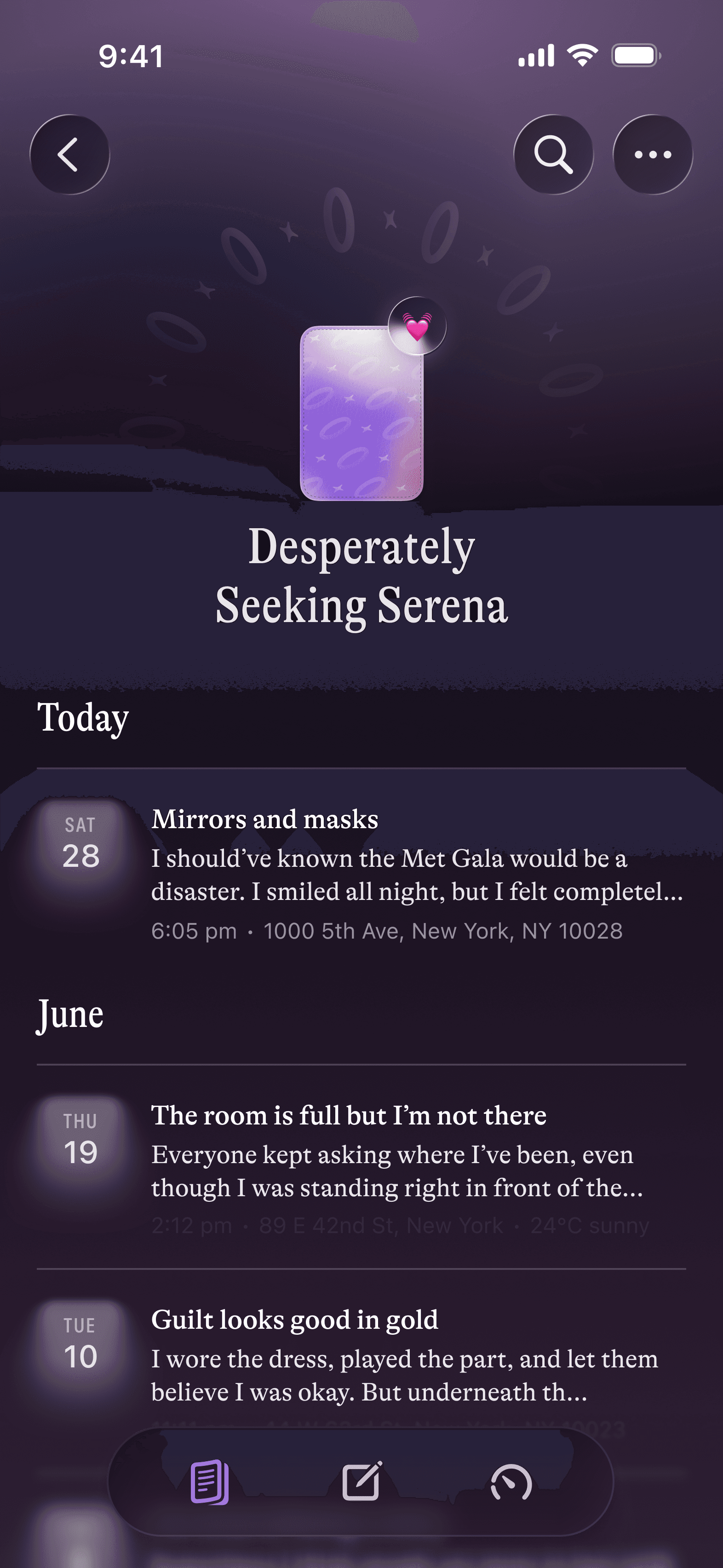
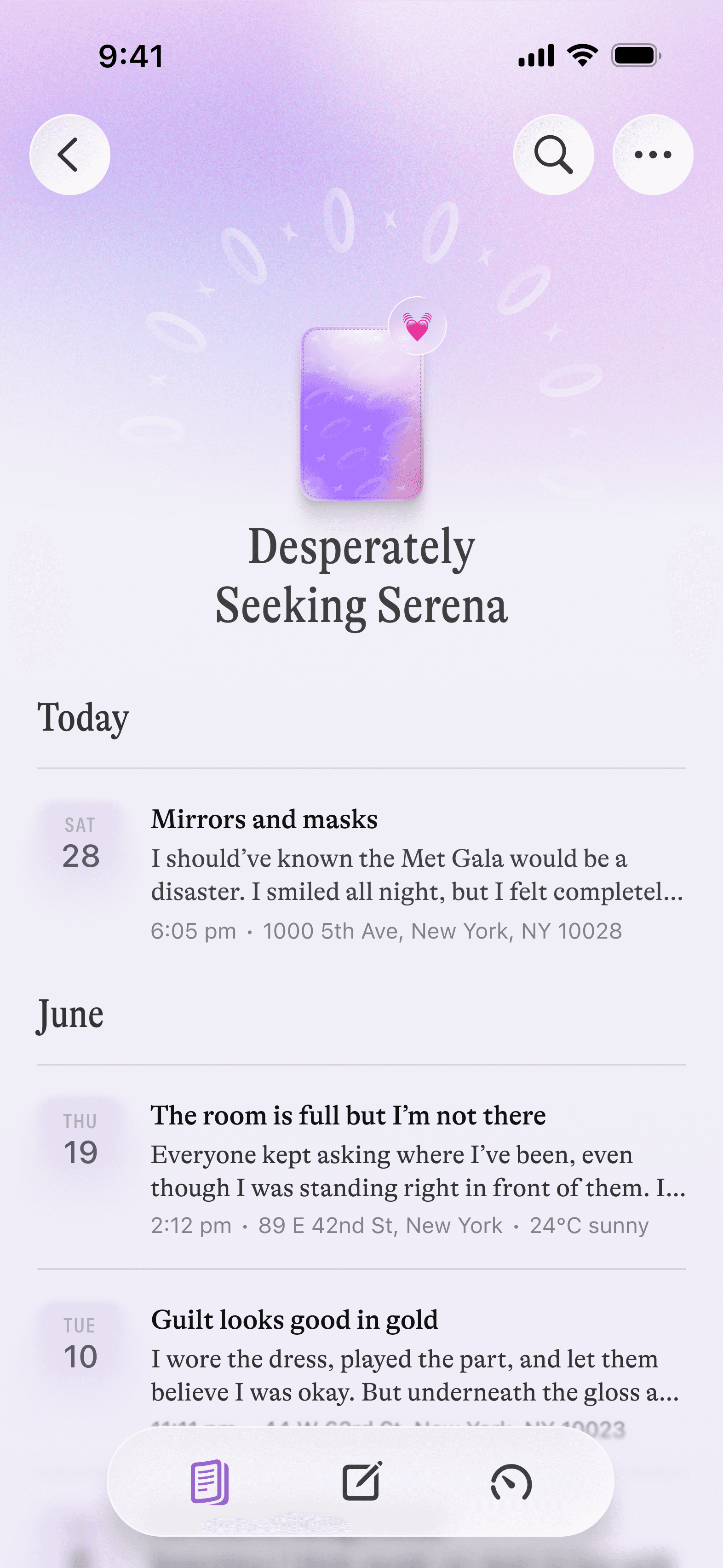
Core to Moodring’s interface is the Insights feed, a dynamic, dashboard-style interface where users can explore bigger picture trends over time and reflect retrospectively.
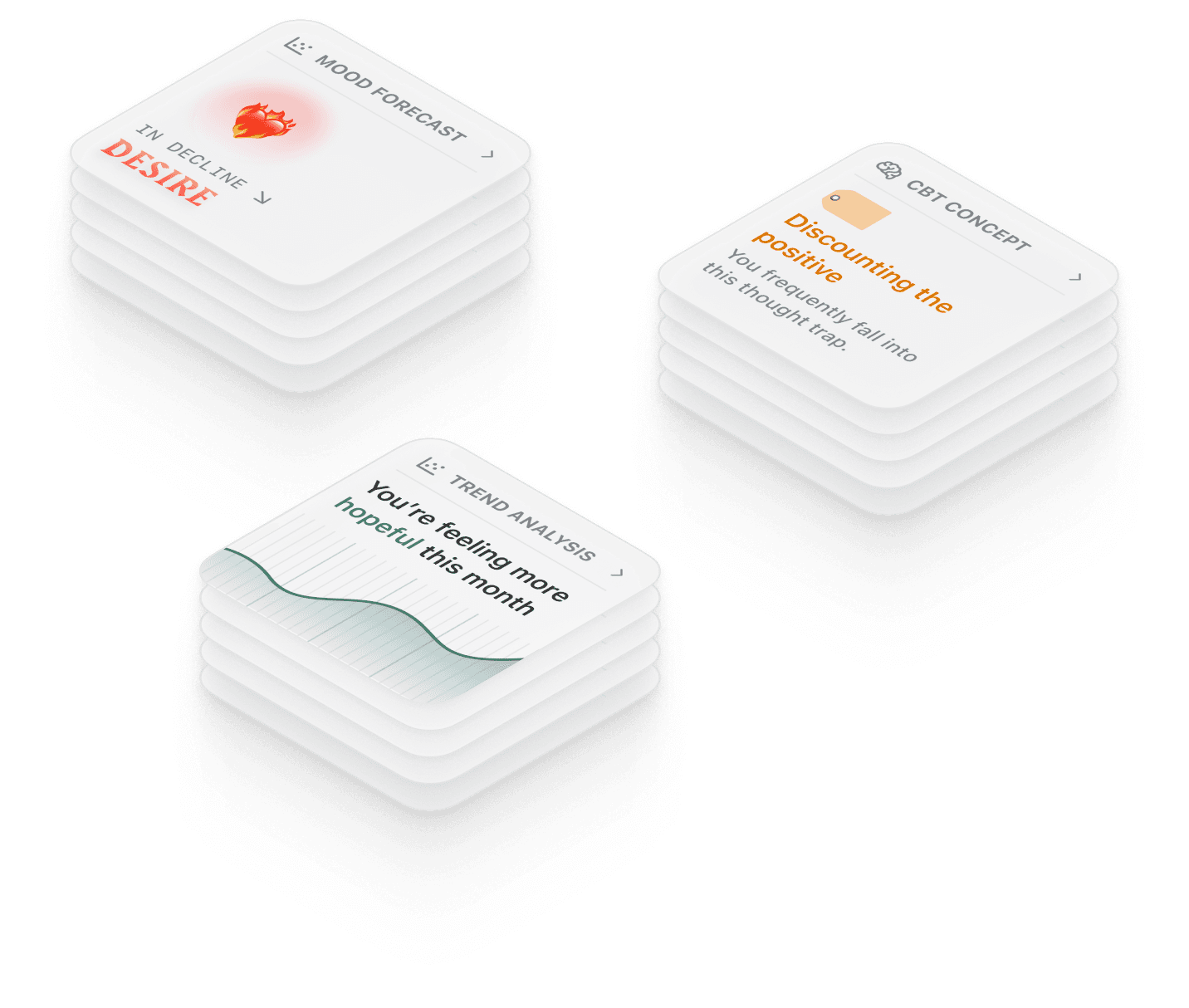
The feed employs a widget-style insight delivery system, which frames content as accessible, modular, explorable and bite-size, fostering dynamic and sustained engagement with content that ultimately enables the goal of self-reflection.
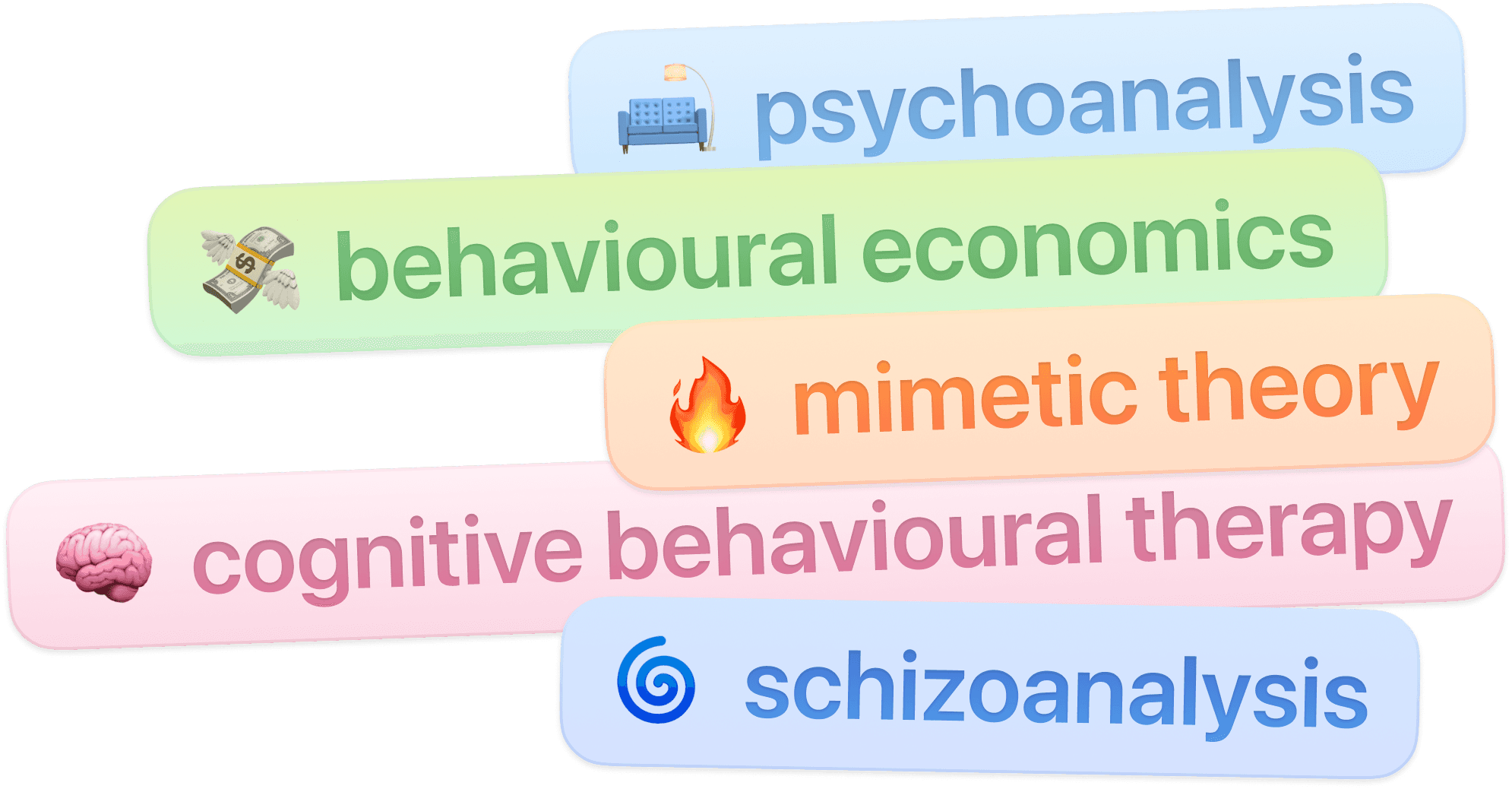
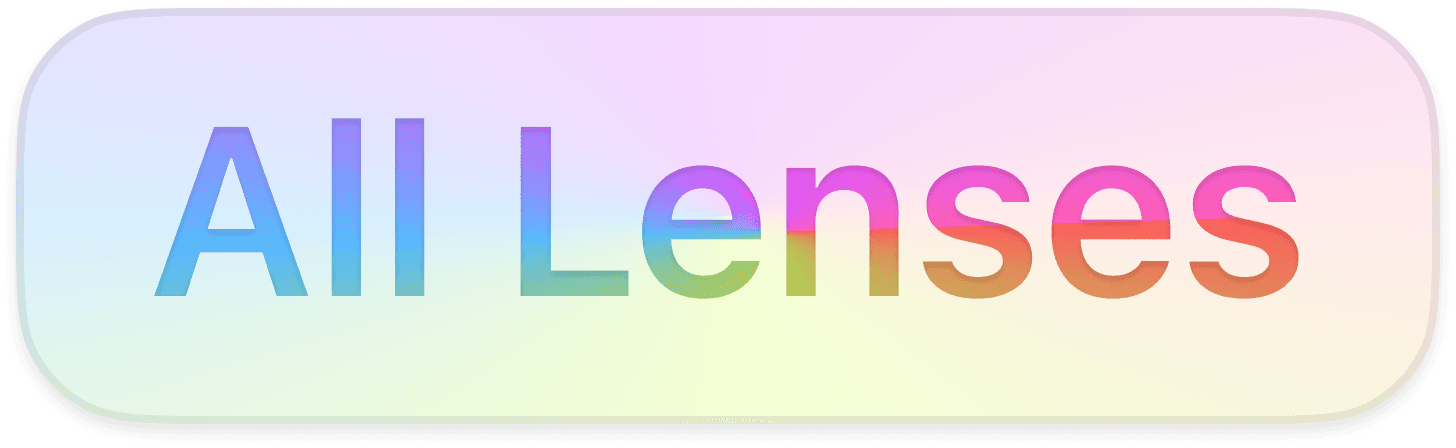
Lens filters give users more control over the type of insights they see. The wide range of multidisciplinary angles gives users flexibility and enables a high degree of explorability in the feed.


Dynamic content creates a feedback loop with user reflection as an input, fostering repeat engagement via continual reflection.
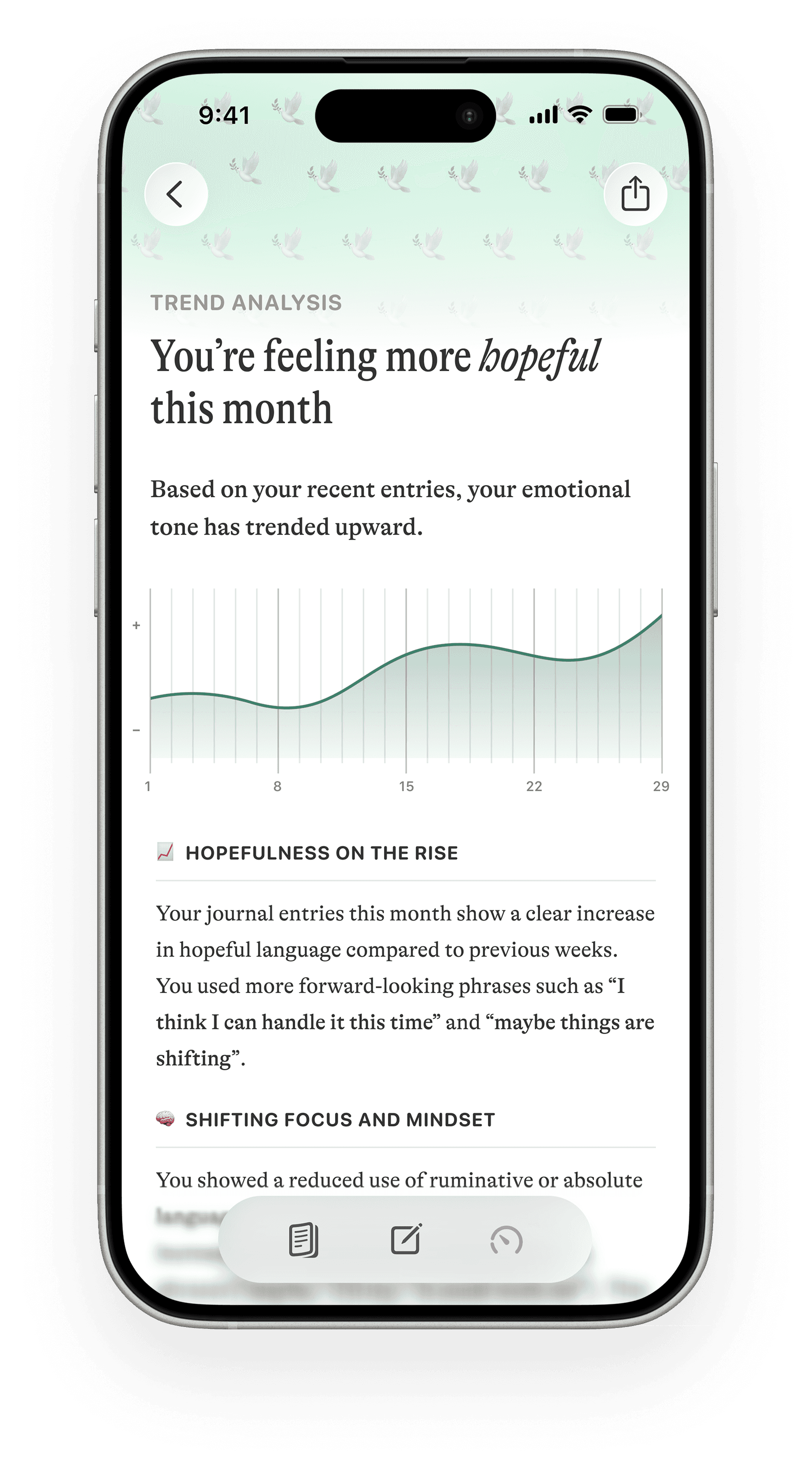
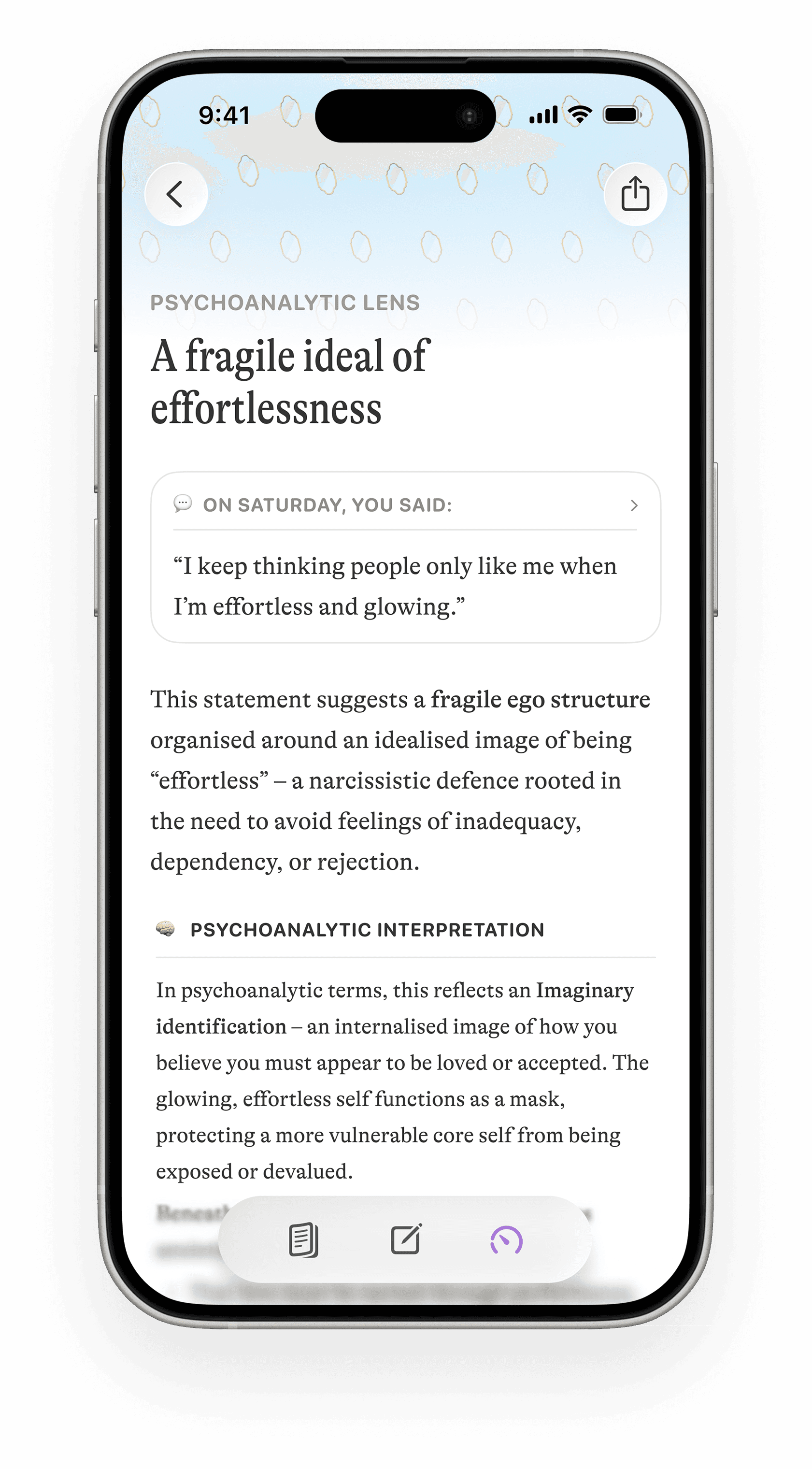
Within the Insights feed, the breadth of content affords a highly explorable experience for casual users, while insight depth within expanded view also caters to users interested in deeply unpacking their insides.

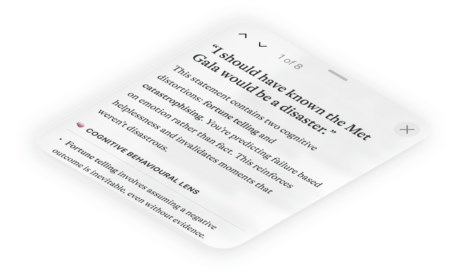
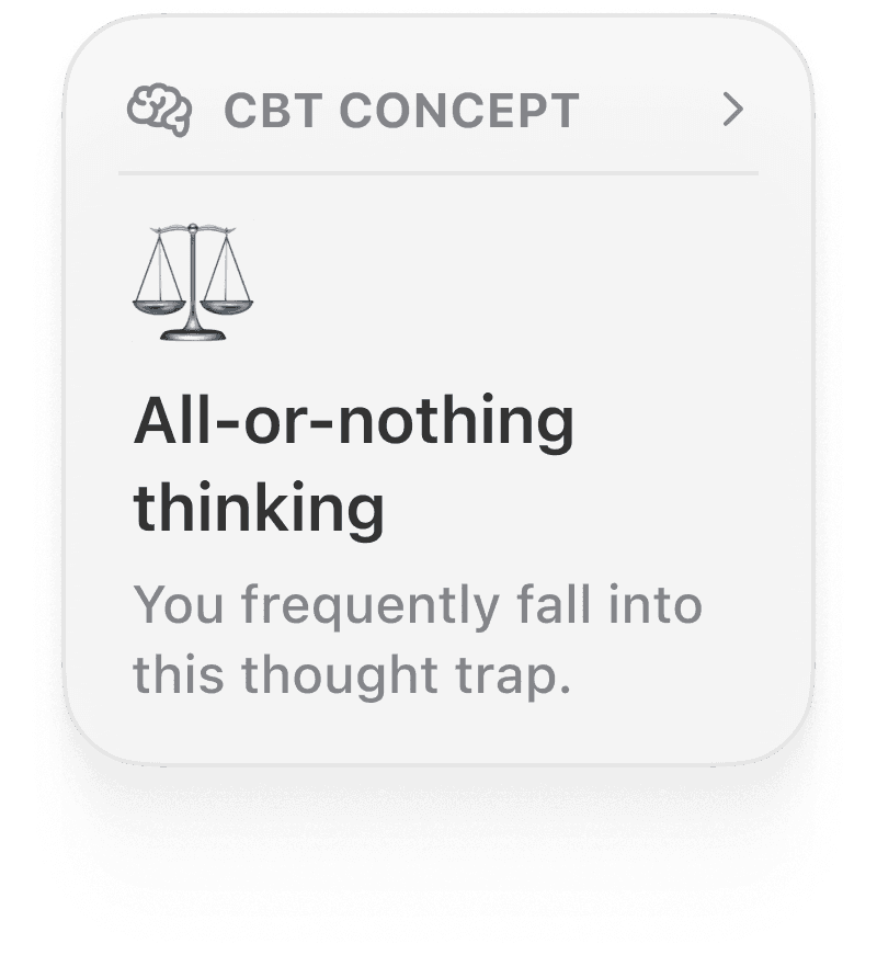
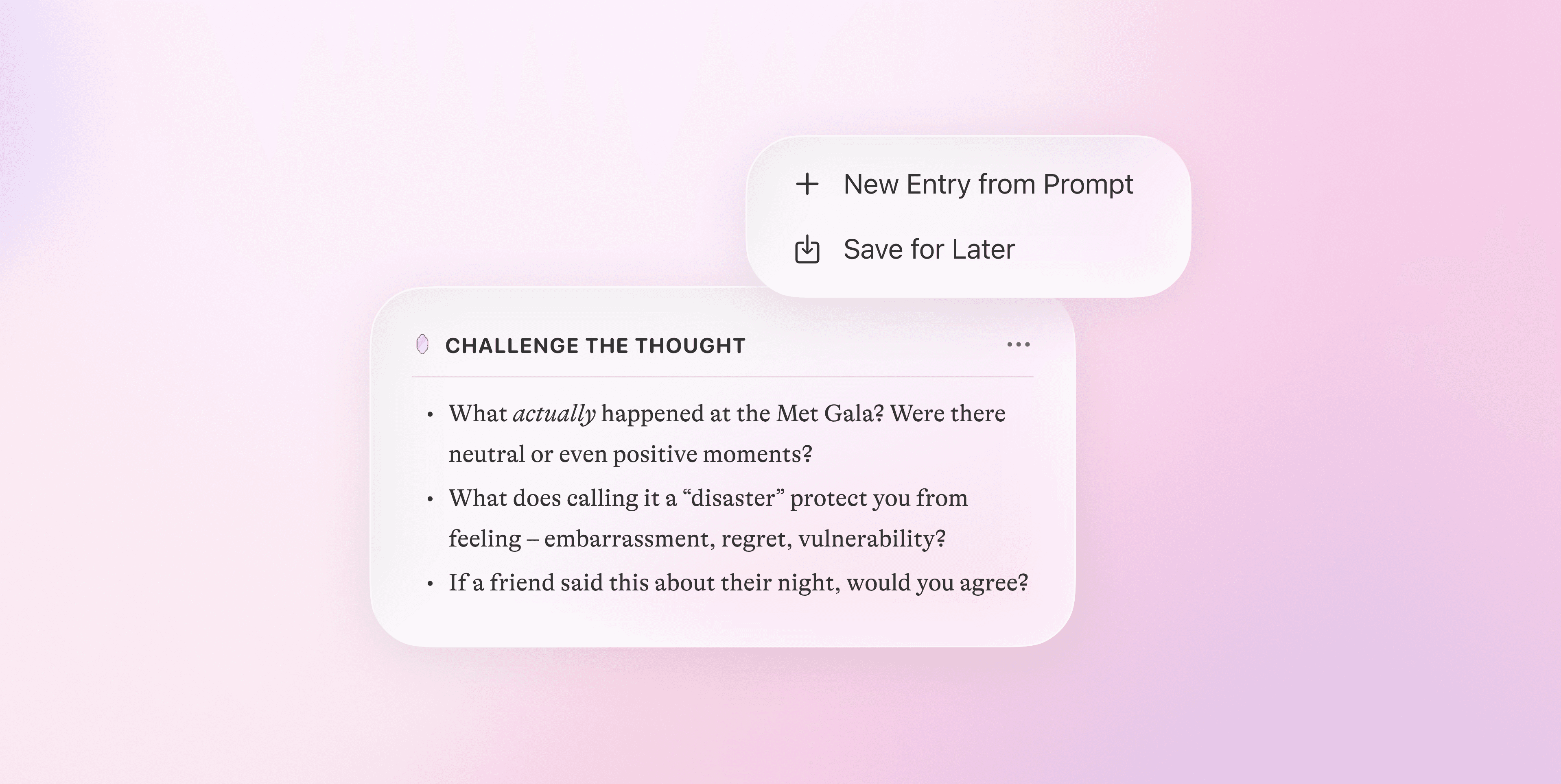
Highlights Mode
Users can enable highlights mode to reveal personalised annotations within their entries for immediate, contextual reflection and access to targeted prompts in real time.
Journaling experience
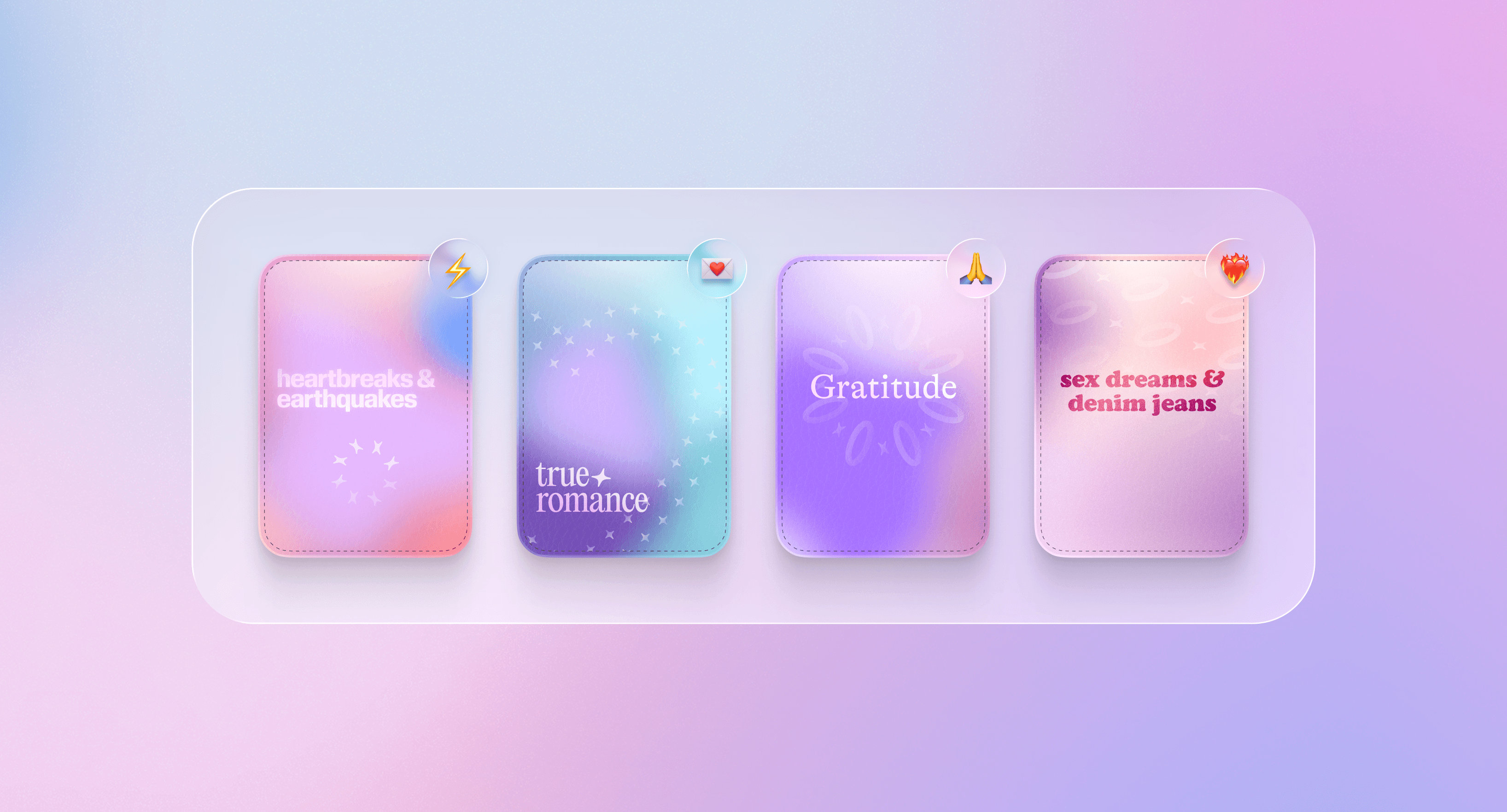
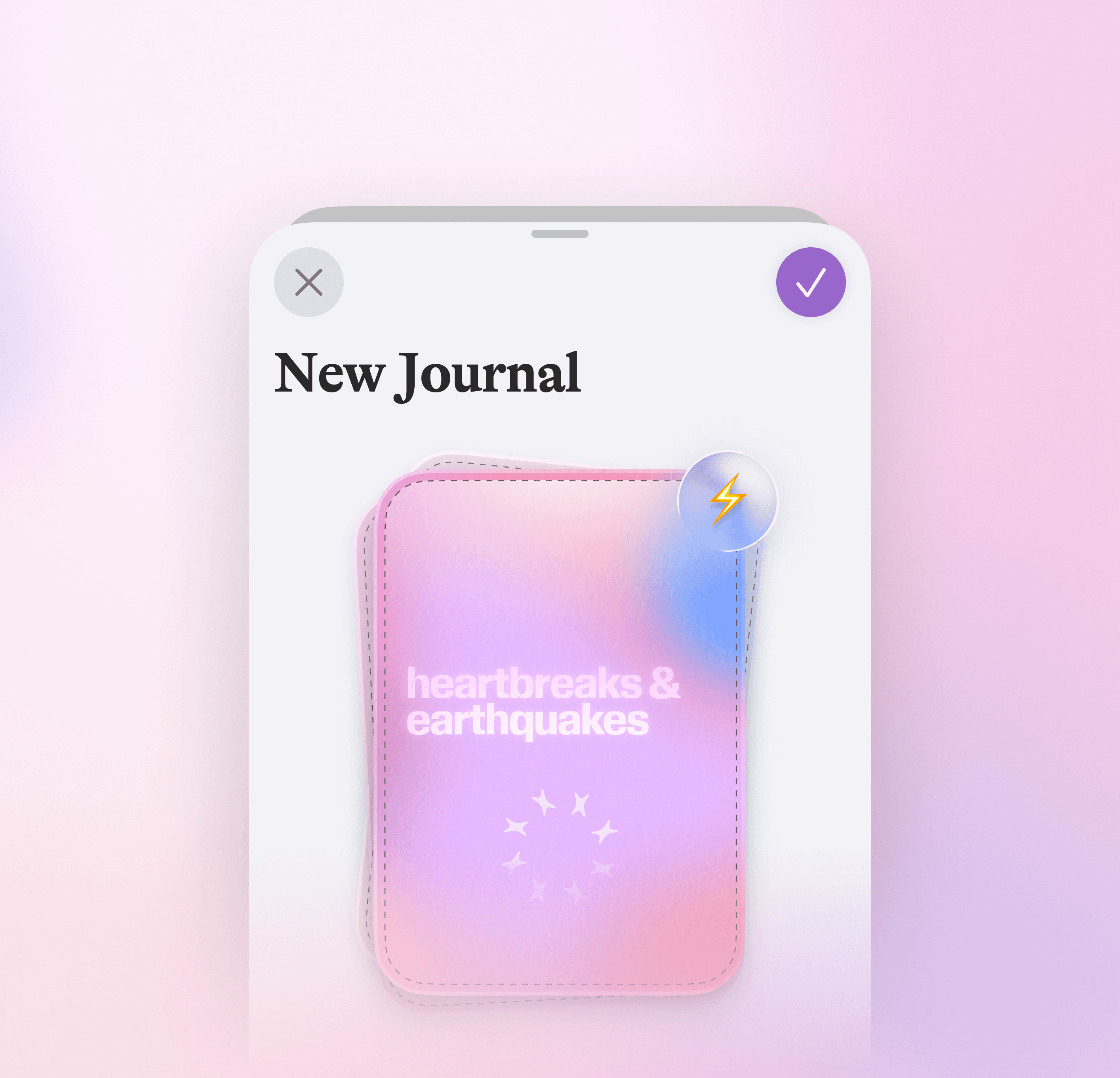
User personalisation is at the core of Moodring's design system – customisable journal covers are one such example. I employed a vibrant take on neumorphism to hint at object physicality and enable some of the personal embellishment often lost in translation between traditional and digital journaling.
User testing: design iterations
I added a hide insights feature to help users manage anxiety or cognitive overload around negative trends.
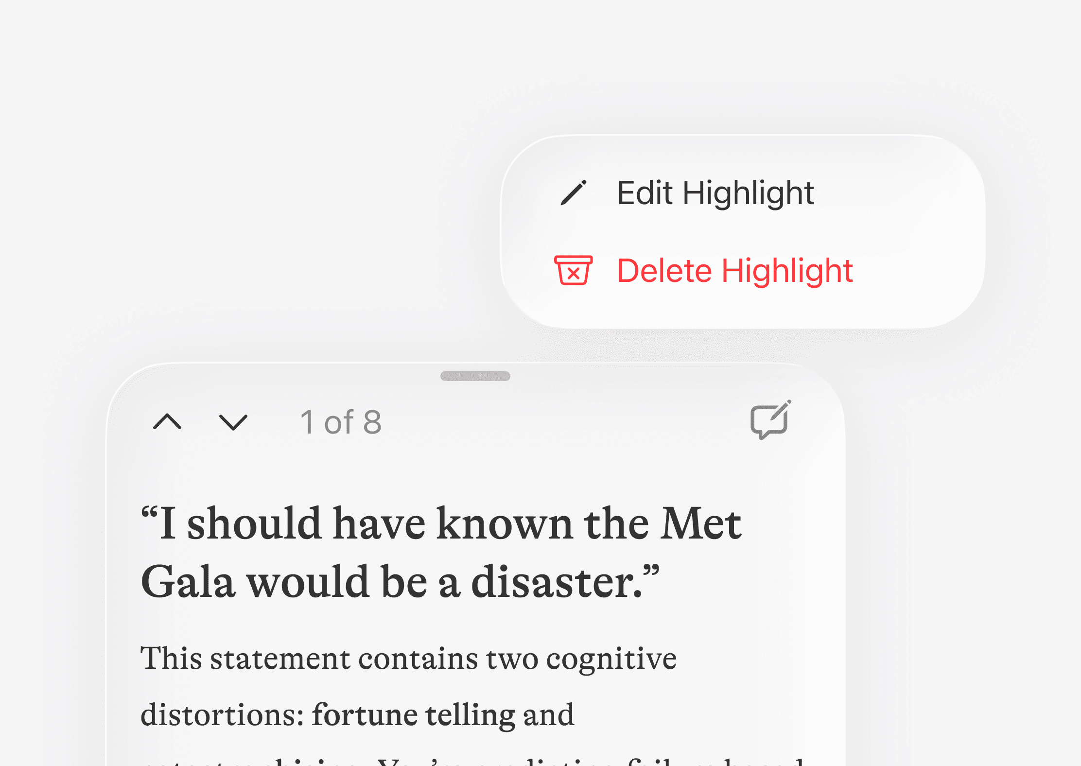
Users wanted more control over AI-based content, so I introduced options to edit or delete proposed highlights.
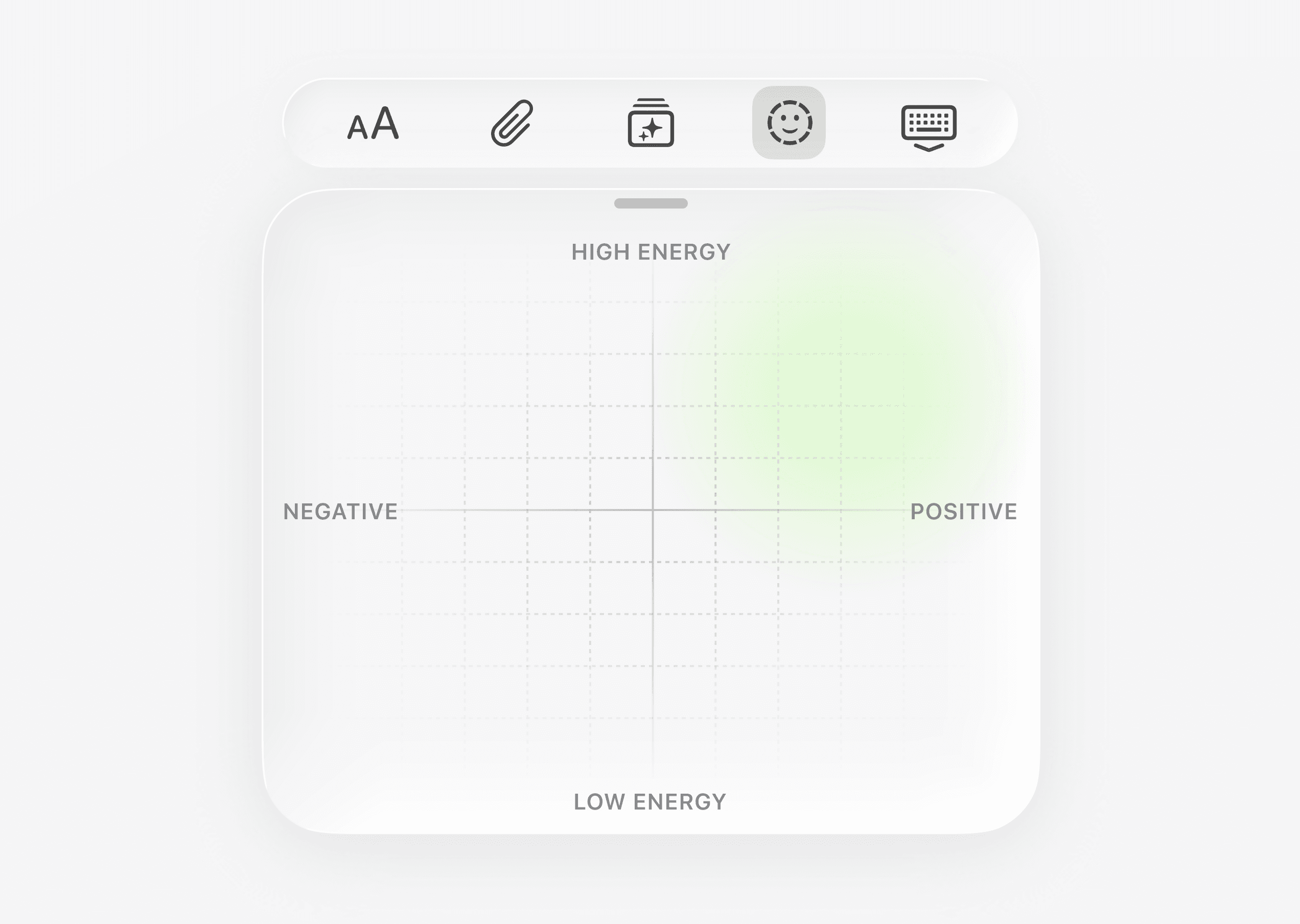
Users varied in the time and effort they had to spare, so I added a simple mood slider as quick, low-effort entry-point.
Reflection
© 2026 Joseph Cholakyan